Senior Designer & Illustrator @ Booking.com, Partner Services // 2019
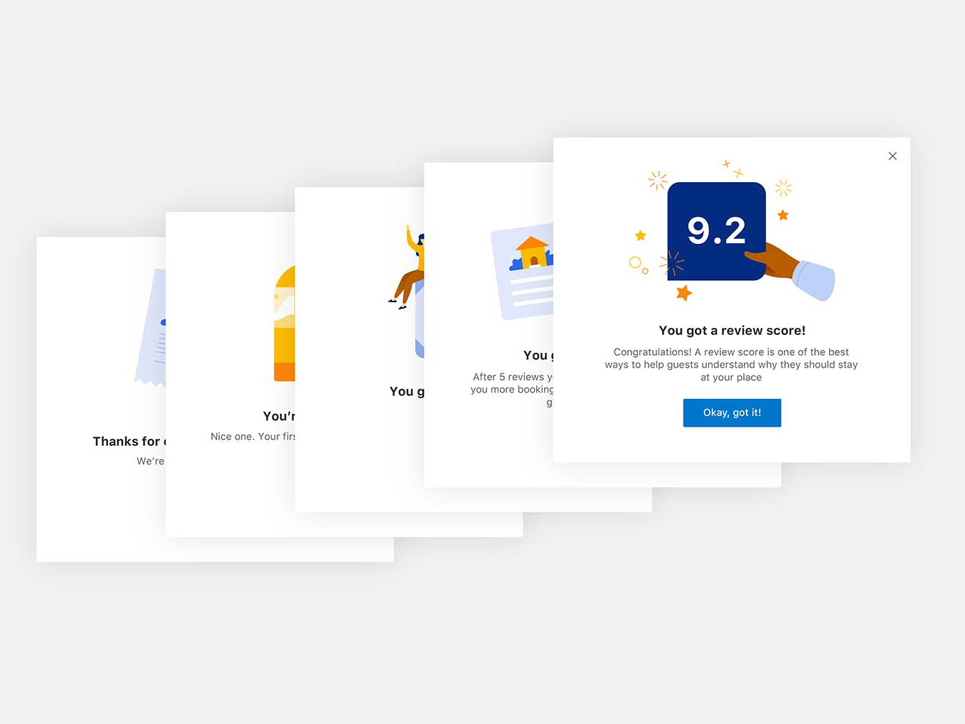
The goal of this project was to add illustrations to all empty states in Pulse app for consistent and more engaging customer experience. As a result, 15+ empty states got a new look and feel:
Some of the empty states
Taking copy into account
But it was more than just adding the visuals. Illustrations always work together with words, that's why I involved a copywriter in this project – to make copy more clear, actionable and, whenever applicable, more positive and encouraging:
The guidelines
On of the chapters of our illustration guidelines for partner products was about illustrating empty states. For all empty states in Pulse I used neutral colors – to communicate clearly but not distract, and accent colors – to bring attention to what's most important (for example, what was actually missing, or a metaphor for it):
Working on the metaphors
When it comes to illustrations, metaphors play a very important role. And for some empty states, choosing the right metaphor was particularly challenging. For example, what is a good metaphor for booking? A suitcase? A key to a hotel room? Or maybe something that looks like a booking confirmation page? These were some of the variants I came up with for “You don’t have any upcoming bookings yet” empty state:
After rounds of reviews and feedback sessions, I came up with an idea that booking might not necessarily be related to an object – it could also be a hotel receptionist waiting for travellers to come. This metaphor was more universal and thus was a better choice:
Implementation
I also worked closely with iOS and Android tech leads to ensure our empty states look good on all platforms and devices with no compromises made:


