Senior Designer @ Booking.com, Partner Services // 2019
Opportunity
There are more than 28 million accommodations registered at Booking.com. These are Booking.com's partners, and we provide them with a set of tools and products to grow their business (things like special offers, programs and promotions). Each product was owned by a different team and was represented by a product page with a similar structure; however, the products didn't follow the same visual language. This resulted in less efficient work for Designers and an inconsistent user experience for our partners.
Solution
Define the common elements across all the product pages, and create a library of product patterns and templates to be used by all teams in the Partner Services area.
My role
Working on this project I was in close collaboration with design leadership in the Partner Services area and the Design Systems team. I worked on defining and documenting the product patterns, supporting and educating Designers in the area on why and how to apply these patterns in their work.
Outcome
The outcome was a library of product patterns and templates used by 20+ teams in the area. This helped improve consistency and quality across all our partner products, resulting in faster design work and a better experience for our partners.

The process
The first step was looking through all the product pages for our partners, defining the common elements based on their purpose.
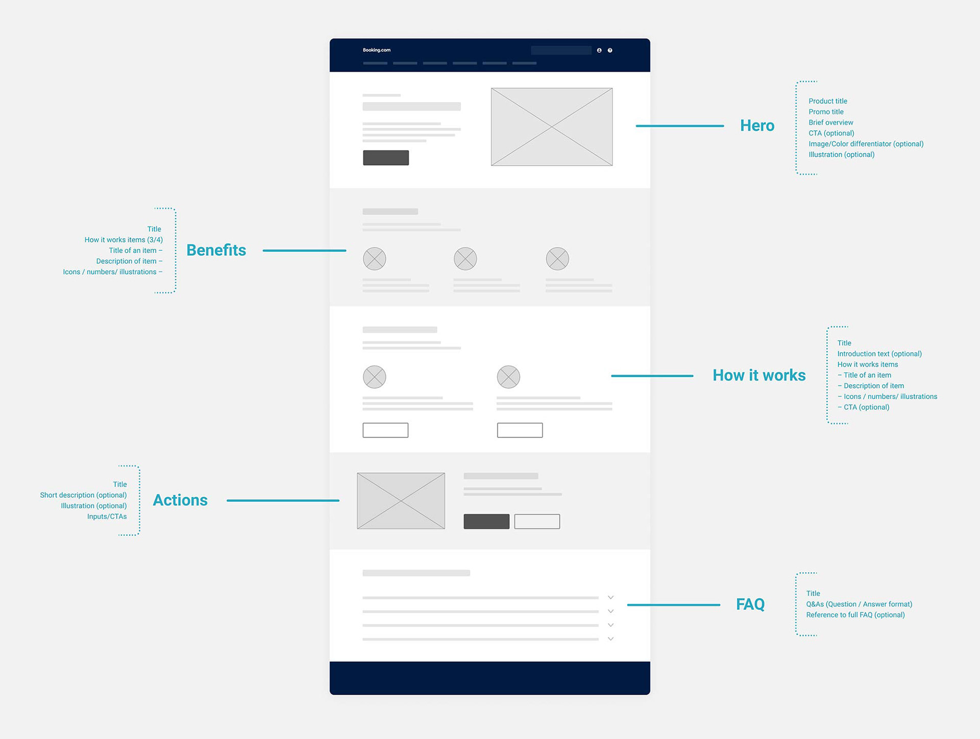
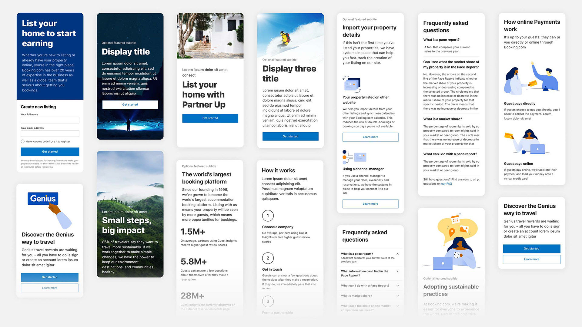
Product page anatomy
To ensure flexibility, the next step was defining the possible variations for each element. Some product pages were mostly informational, others required log in forms, and some invited you to try out a new product. All of these pages should have been aligned and followed the same visual language, but they weren’t.
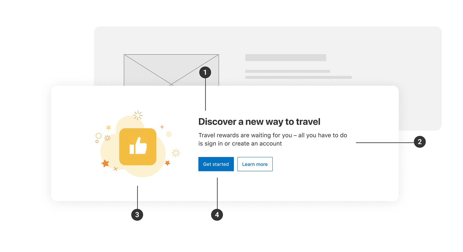
Here’s an example of the Hero block variations for both desktop and mobile. The Hero is the first and most visible part of the page: it represents the product and should give minimal (but sufficient) information about it.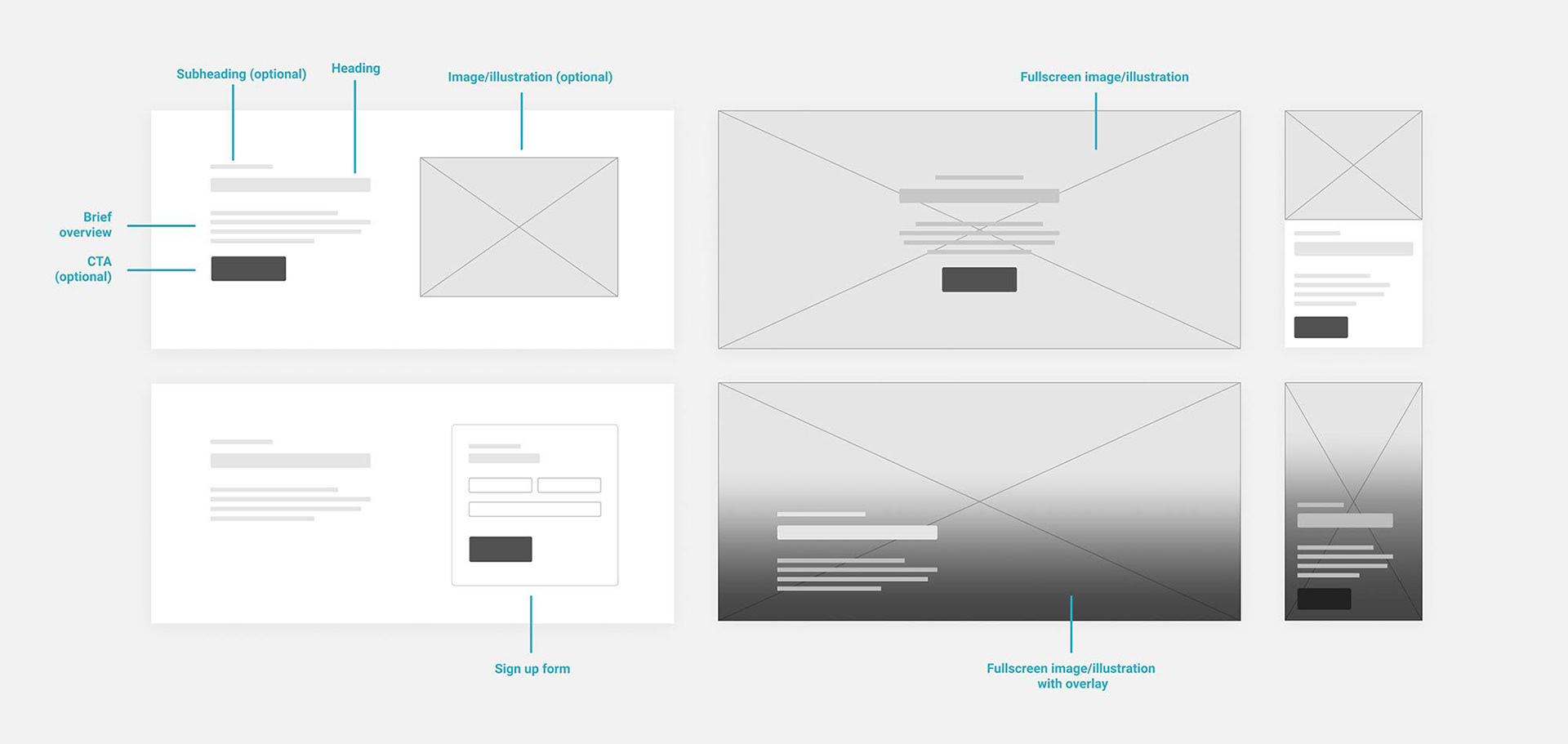
Hero block possible variations
The next step was designing new patterns and their variations. This new set of components would extend our existing design system, with a particular focus on partner products. I also worked on documentation explaining each of the patterns, and created page templates serving as examples and inspiration. All the product patterns were available as components in Figma.
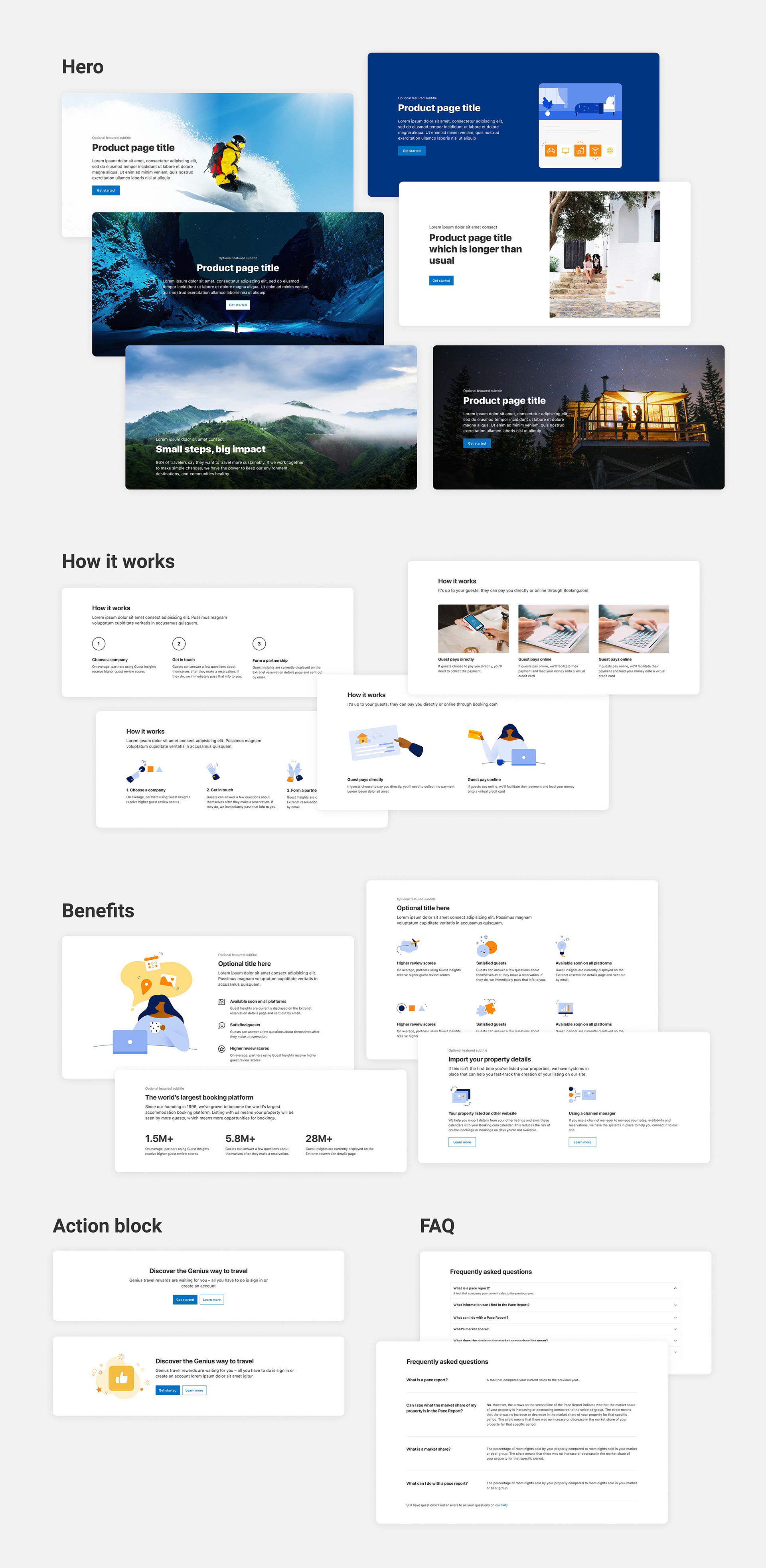
Of course, all the patterns were responsive:
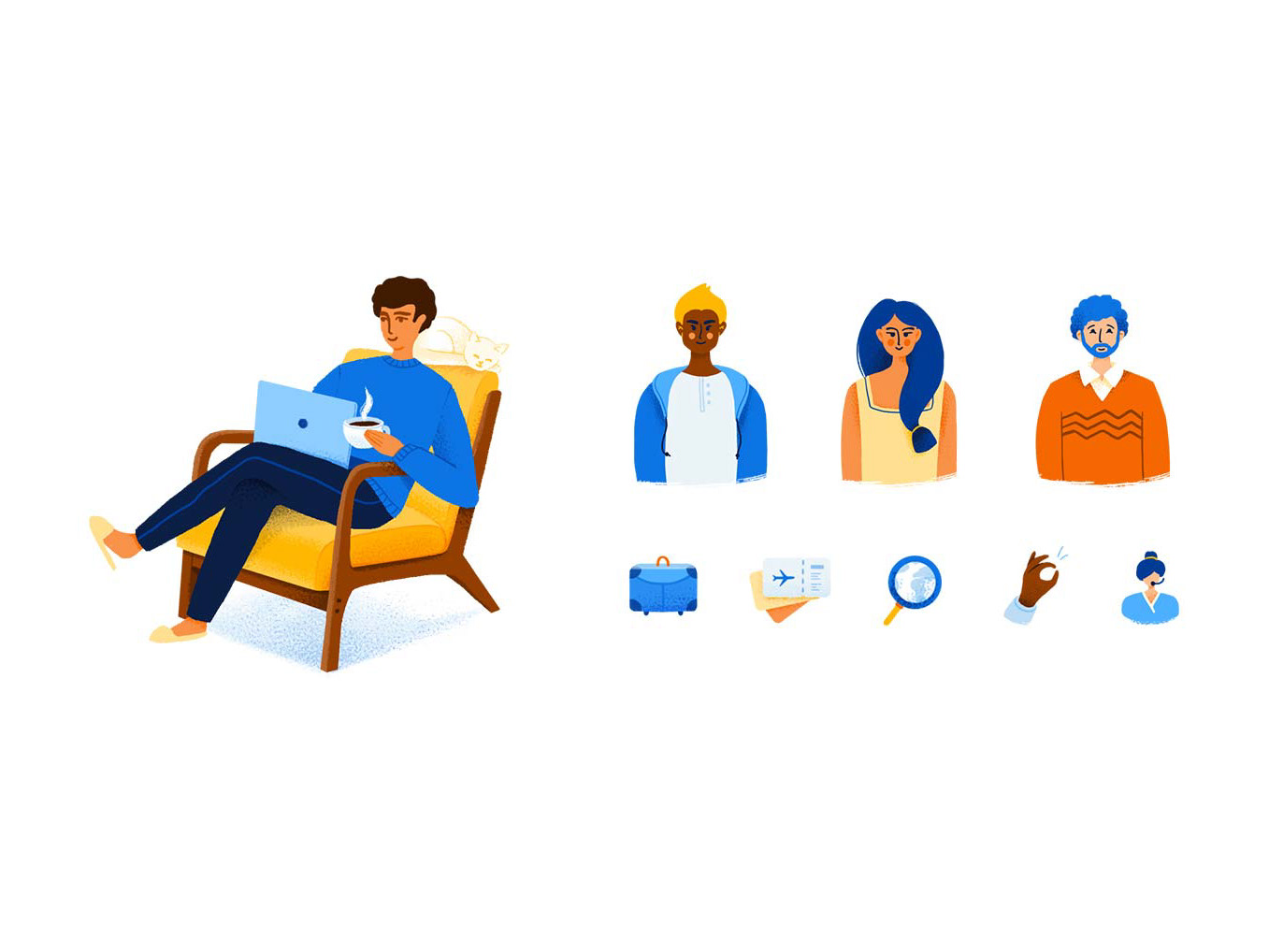
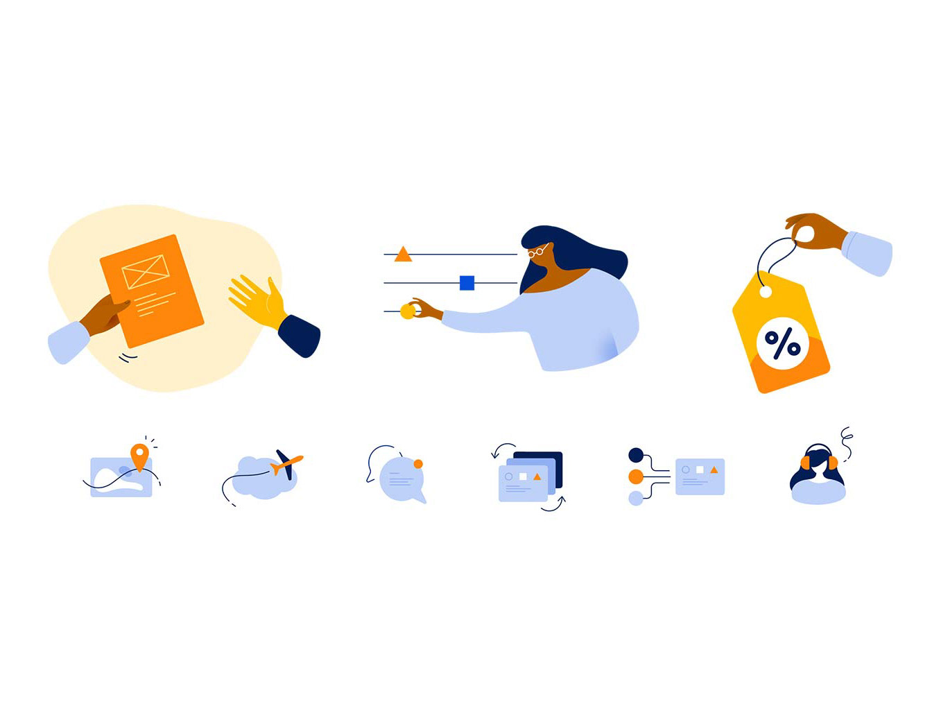
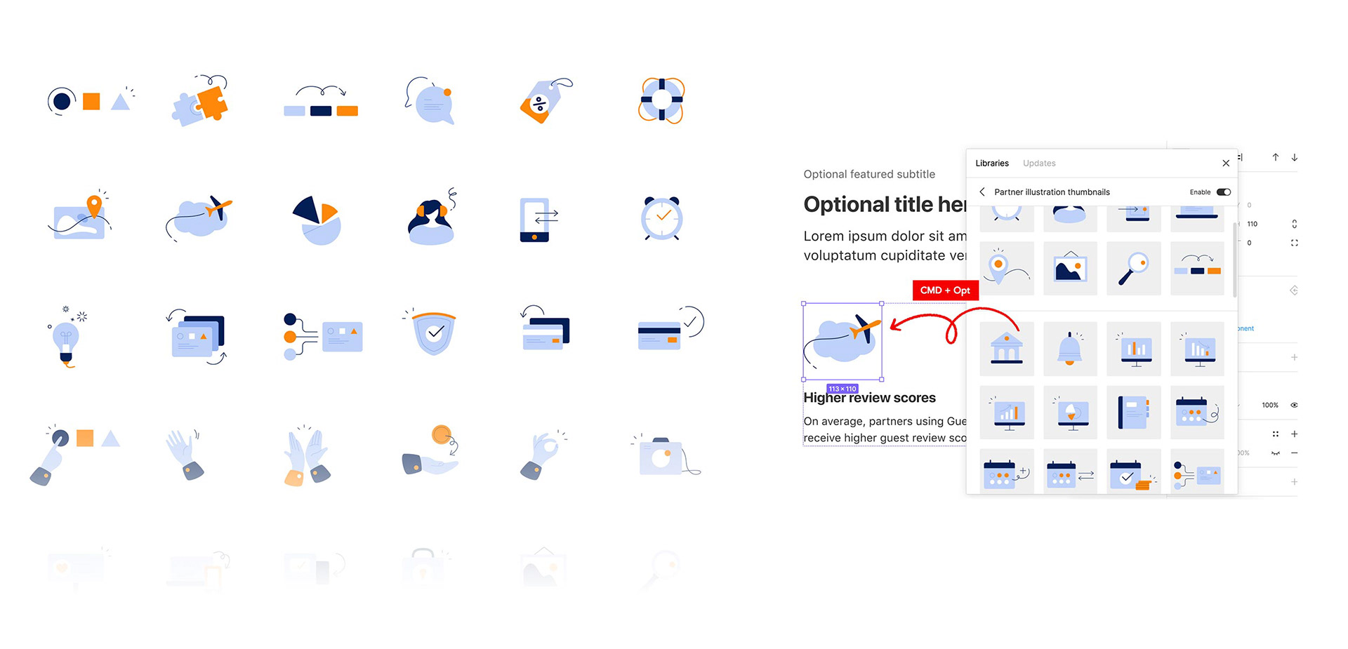
Thumbnails library
As part of this project, I drew a set of 50+ reusable thumbnails that everyone could use on the product pages. These illustrations were also available as a Figma library and through our internal iconography service for faster development.
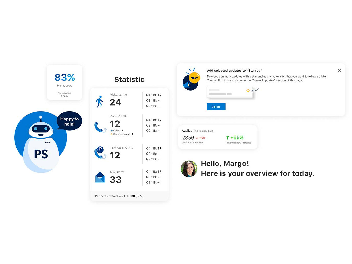
Product pages transformation
Having reusable patterns helped bring a consistent look and feel to all our partner products.
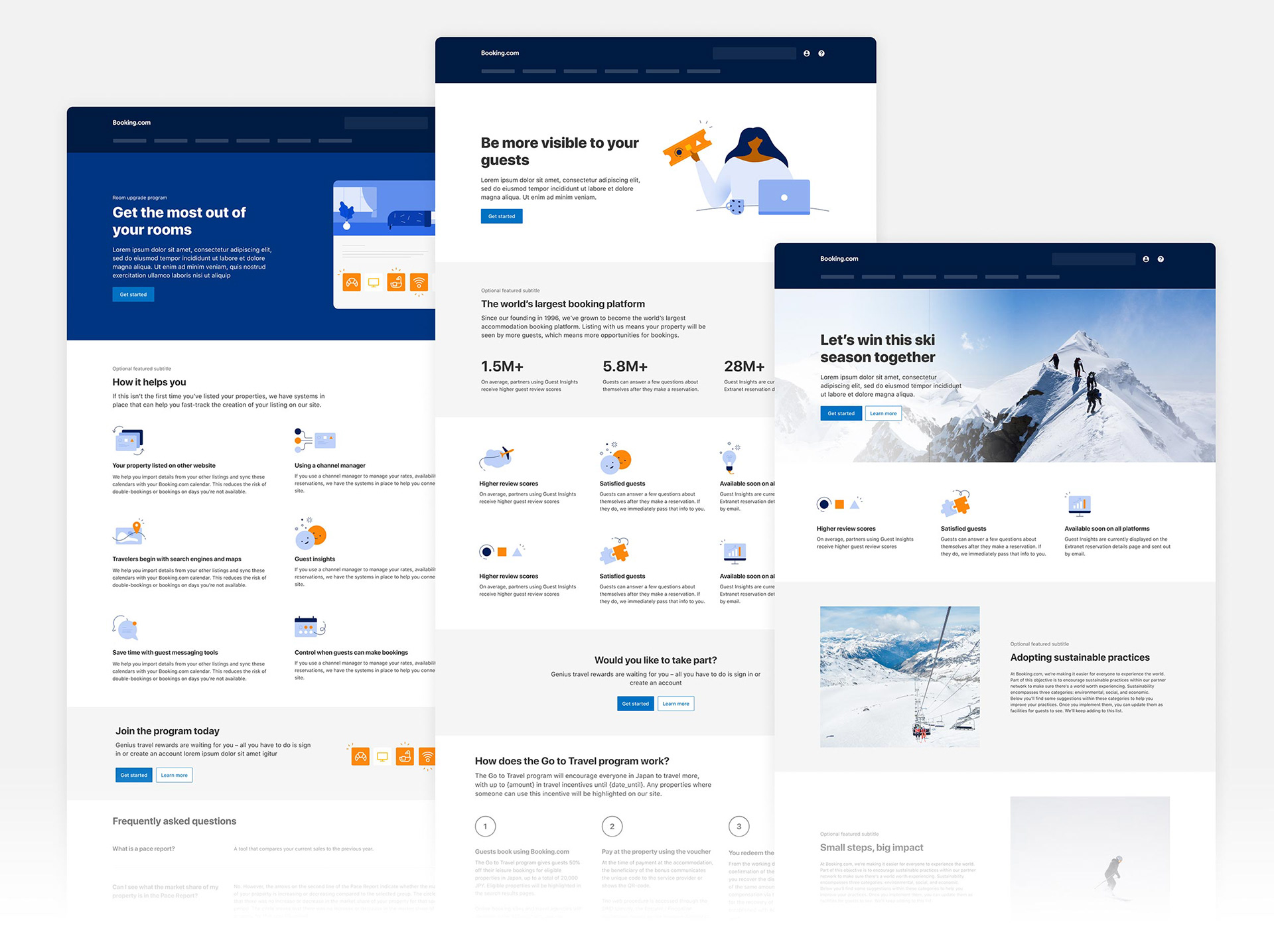
Product pages with new design components

The result
After piloting new patterns with a few product teams first, the library was soon rolled out to all the Partner Services area. The new set of patterns helped our 20+ product teams quickly resolve common, recurring situations, so that they could spend more time on new challenges. All product pages started to follow the same design language, resulting in a better design quality and a consistent experience for our partners.